HOW has the coronavirus stock market crash compared with earlier ones? Is there a pattern?
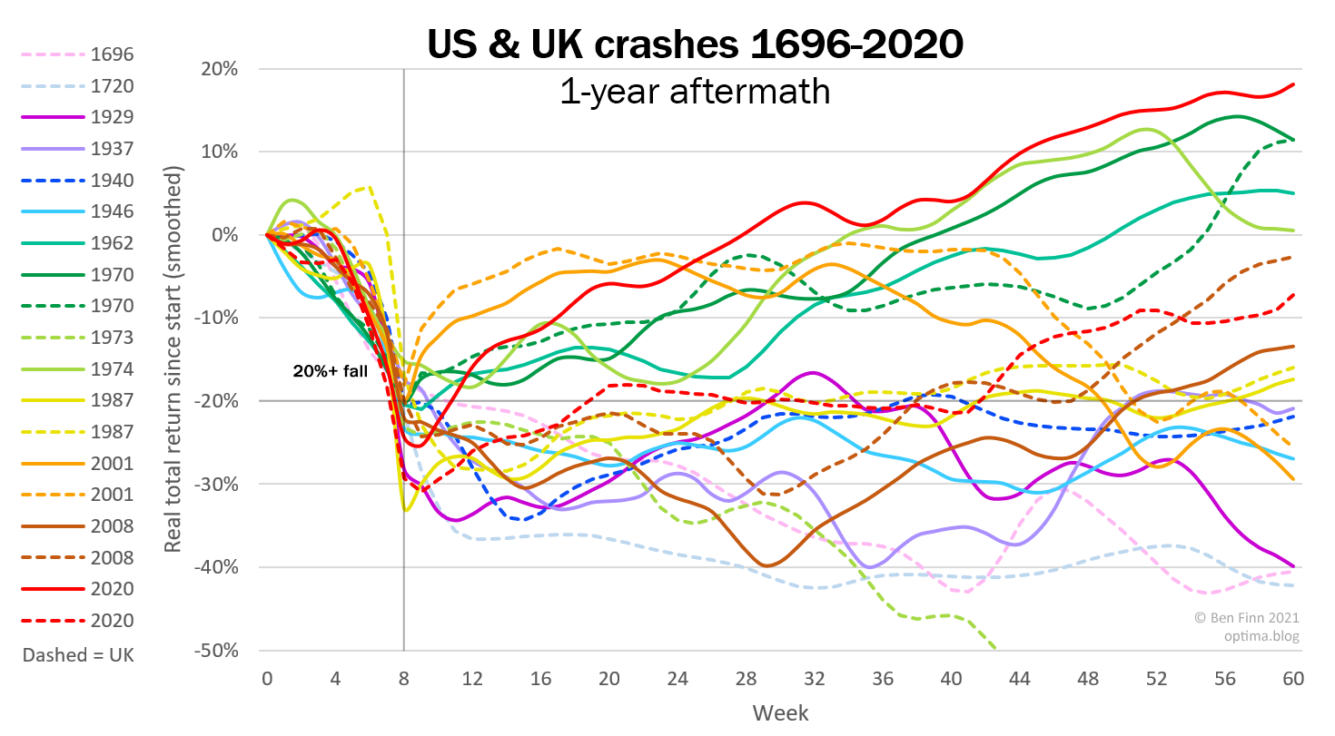
A year ago I looked at all previous US and UK meltdowns throughout history. Now we can include the 2020 crash too:

Each coloured line shows a crash and its one-year aftermath, in the S&P 500 index (solid lines) and FTSE All-Share (dashed).1
The red lines show that last year stocks plummeted unusually far, particularly in the UK, where prices fell more than 30%. They then quickly rebounded, giving the US the strongest market recovery in history; and the UK, while not so stellar, fared better than average.
But earlier crashes show how easily prices could have kept falling. The spaghetti-like range of aftermaths illustrates that anything can happen after a crash, with no visible pattern.
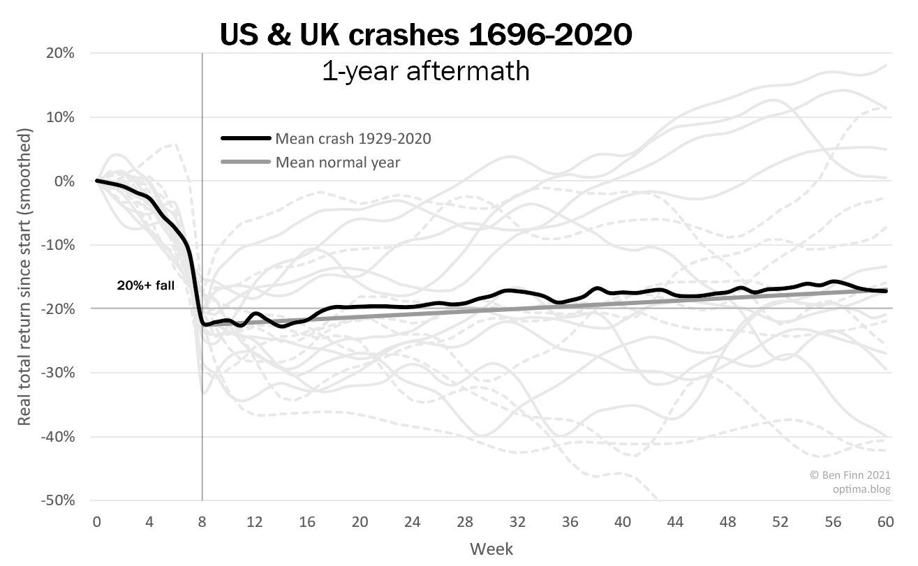
However, there’s a striking bit of order lurking in the data. If we average all crashes over the last century2, this is what we get:

The black line shows that just after crashing, on average prices neither fall further nor rebound, but are nearly flat, rising slowly for a year. Moreover, they closely match an average normal (non-crash) year, shown by the thick grey line, both in shape and slope.3
It’s remarkable that the wide variation and high volatility after a big fall produces no unusual behaviour overall. You’d have thought traders might either be spooked into selling unnecessarily, or hold out when they should cut their losses. But it seems overreactions from some are exactly cancelled by underreactions from others.4 Crash aftermaths form no abnormal pattern, and the lack of one is strangely exact.
(That said, if we divide the crashes up by country or time period, they are inconsistent: the US has generally performed better than normal after a crash, the UK worse, and recent falls recovered faster than earlier ones. But with so few datapoints, those may well just be random variation; averaging all crashes together tells us the most.)
The black line fits a wider theory, the weak-form Efficient-Market Hypothesis, which says that you can’t predict future prices from past ones. Even after a crash, on average they should carry on just like normal. As indeed they do.
(P.S. Though off the right of these charts, more than a year after a crash, stocks seem to rise faster than normal, perhaps due to government stimulus measures.)
If you found this article half-interesting, please share it (top right) or subscribe to future articles (at the bottom).
1 Real total returns, treating a crash as a fall of at least 20% within 8 weeks.
2 Omitting the 1696 and 1720 (South Sea Bubble) crashes, as only a handful of stocks were traded back then. And incidentally it is correct that there were no other crashes (by the above definition) between then and 1929, though there were some slower ones.
3 Average of US & UK real total returns 1929-2020 (grey line) = 6.4% p.a.; average return over the 12 months after each crash in the same period (black line) = 6.1% p.a.
4 Or perhaps, some traders perfectly anticipate others’ over/underreaction, and cash in on it. But they could probably only anticipate this based on smaller, more frequent falls, and only if they produce similar reactions, since past crash data is so limited.
Thanks to Cat and Ari for helpful comments
