WHAT MIGHT the past tell us about how stocks will perform over the next year and beyond?
I previously wrote about the short-term aftermaths of crashes, which — despite wild variation — average out like a normal year. This is consistent with the weak-form Efficient Market Hypothesis, which says the fact prices have fallen should tell you nothing about which way they will continue afterwards.
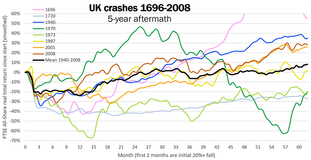
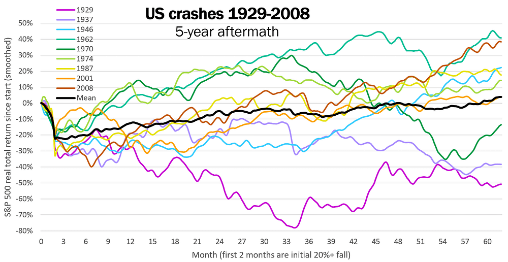
But let’s see what happens longer-term. Here are how UK and US stocks performed for five years after every crash¹ in history:


While each crash was very different, on average stocks rose in the first half of each graph (see black lines). To examine this more closely, let’s average together all 15 US & UK crashes of the past century², and consider the first three years of aftermath:

This suggests three stages:
- As previously discussed, a slight rise on average for a year after the crash, like a normal year (with 5% real return)
- Then a strong recovery for more than a year (averaging 15% return p.a.)
- Then back to normal trendless behaviour (averaging 3% p.a. to five years after the crash).
And each stage has a plausible explanation:
- After the initial shock, efficient markets incorporate expectations accurately, so on average prices are flattish.
- While some crashes do their worst in weeks, and others take many months, the damage is mostly done and remedial measures are started within a year, so stocks then rise quickly. (With exceptions, e.g. the 1929 Wall Street crash.)
- When the situation returns to normal (or a new normal), usual random walk behaviour resumes.
Whether 1 and 2 are distinct stages, or just segments of an upward curve (which depends partly on where you draw the red lines) is moot, but the general upward trend seems likely to be real — that is, to suggest similar behaviour in future crashes.
Stage 1 and 3 seem a bit different from each other, though both are close enough to normal growth rates. The fact stage 1’s average rise is fairly steady whereas stage 3 looks more random may well just be chance, due to the small sample size.
Implications for 2021
How does all this relate to where we are now? Since the March 2020 crash, stocks have performed much better than average (as with the 1970 crash), though this is compatible with the wide variation in past aftermaths. The seeds of stage 2 are being sown in the form of vaccines and stimulus measures, and interest rates are low, making stocks attractive; so it is at least plausible that they might continue to rise. So let’s suppose that they will, in line with past aftermaths:

Even though stocks have already recovered to pre-crash levels, the Efficient Market Hypothesis says prices don’t care about the past; so this shouldn’t stop them rising further, as the red line shows for previous aftermaths. Nonetheless, as a forecast, this should of course be taken with a big pinch of salt. At best it shows a broad underlying tendency, on which numerous specifics of this situation will be superimposed (e.g. if the new COVID strain spreads faster than people can get vaccinated).
The grey lines show the variation in past aftermaths, as they played out from where we are now. We can treat them as good and bad scenarios for 2021–2: there might be even stronger rises, or another fall (perhaps by 10%) with no recovery for years. And as the grey lines are only one standard deviation from the mean, it could turn out even better or worse.
But if this general pattern is a real feature of crashes, and the current aftermath is not too atypical, it would be a fair bet that stocks will keep rising in 2021 and beyond.
If you found this article half-interesting, please scroll to the bottom to share or subscribe.
¹ S&P 500 and FTSE All-Share real total returns, taking a crash as a fall of 20% or more within 8 weeks.
² Treating UK and US crashes as comparable but somewhat independent, to increase the data points. In fact the later crashes occurred simultaneously in both countries (due to globalisation), which has the merit of weighting the results towards recent history — more relevant to predicting the near future. If you’re concerned the mean is overly influenced by outliers, the median (not shown) produces a similar line.
